USGS.GOV Seeks Feedback
A story about a launch of a federal website recently caught our eye. Published by FCW: The Business of Federal Technology, the article is entitled “USGS Unveils New Web Presence, Seeks Feedback.”
The post highlights how the U.S. Geological Survey (USGS) recently launched a beta version of its new website. USGS is actively soliciting user feedback to help them ensure a positive user experience, including consistent navigation, an intuitive flow of information, and mobile-friendly design.
A UX Lesson
The approach taken by the USGS web team is in dramatic contrast to the rough start and problematic launch of another federal website – healthcare.gov. User confusion, difficult navigation and an overly complex site layout plagued the launch. We’re pleased to see USGS take this wise step of soliciting user feedback for their redesigned website.
Why Solicit Feedback?
After visiting the current USGS site http://www.usgs.gov/ then clicking over to the beta site http://beta.usgs.gov/ we see the wisdom in the agency’s approach. The beta site is aiming to deliver simplified design, mobile-responsiveness, improved navigation and search capabilities, and an overall enhanced user experience.
How Did They Do From Our Standpoint?
Larry Rusinsky, one of TecEd’s IA and user research experts, took a look at the site and below are his findings. (Bear in mind that a one hour evaluation of a complex site with such rich content is only a broad overview of first impressions).
Larry’s Expert Evaluation
The global navigation on the current site is sparse and feels unbalanced (for example, Maps, Imagery, and Publications vs. Jobs).

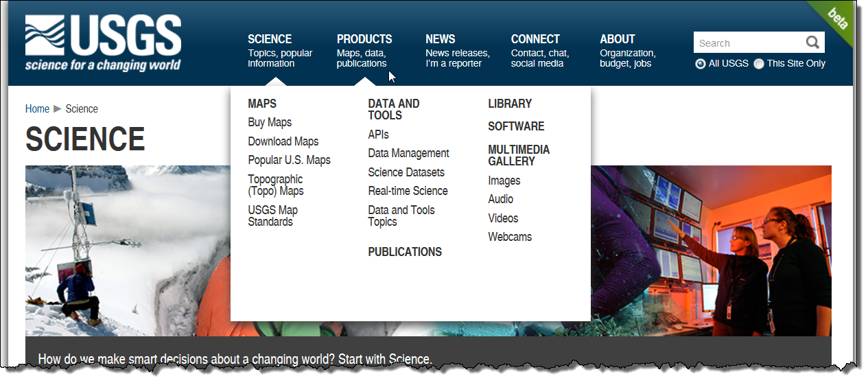
The new navigation on the beta site includes submenus on hover that provide a better overview of the rich content of the site. A minor quibble: the two pointers that appear for the submenus—one marking the current area (Science below) and the other for an area being examined (Products below) are indistinguishable.
 The primary navigation is mirrored at the bottom of the page (although without the submenus).
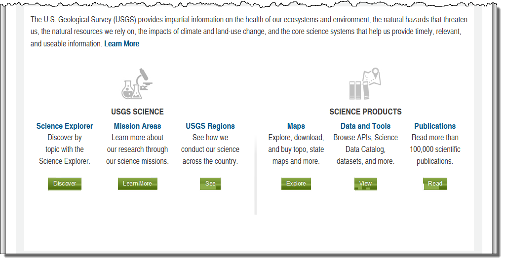
The six green buttons below (Discover, Learn More, See, Explore, View, and Read) are a little confusing, and seem chosen simply to be different. It’s not clear how the target areas might differ and what actions will be available when you get there.
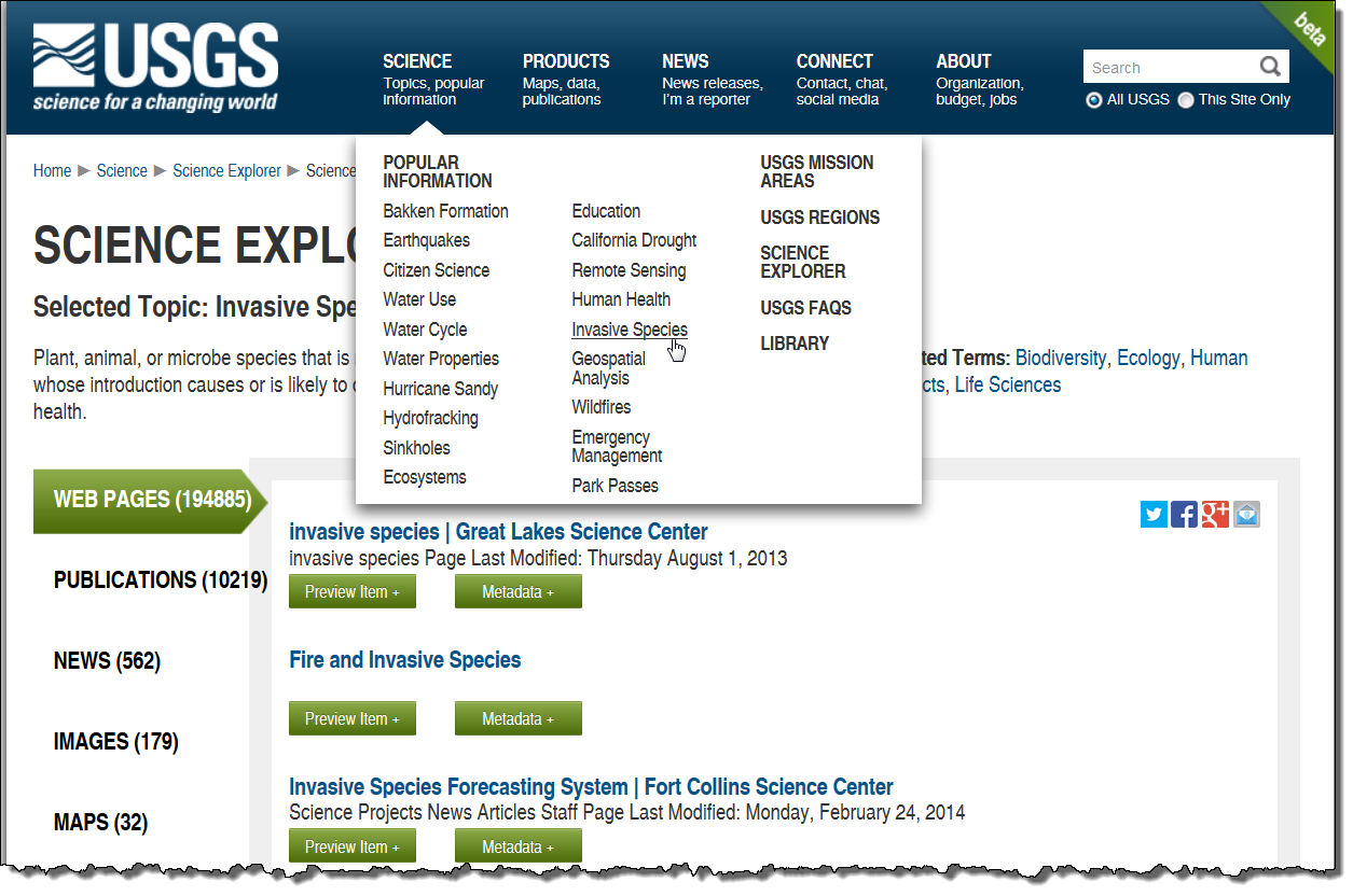
Beyond the main navigation, subareas of content can be somewhat confusing. For example, on the following screen:
Selecting Invasive Species from the Science menu brings the user to what appears to be a search results page (Science Explorer Results). There seems to be no way to refine the search, however, so in this case, it appears the user needs to browse through 10,219 publications, 562 news items, and so on.
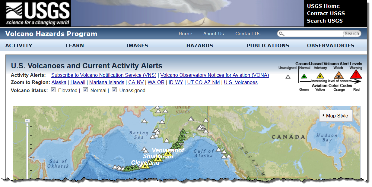
There remain many subsites with their own navigation systems, such as the Volcano Hazards Program page below:
This may be an artifact of this being a beta site, or these subsites might remain. The only way to return to the main USGS site is the USGS Home link in the upper right corner.
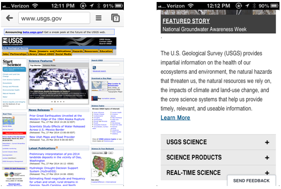
The new site is mobile-friendly, as shown in the comparison below (existing site on the left, mobile version on the right):
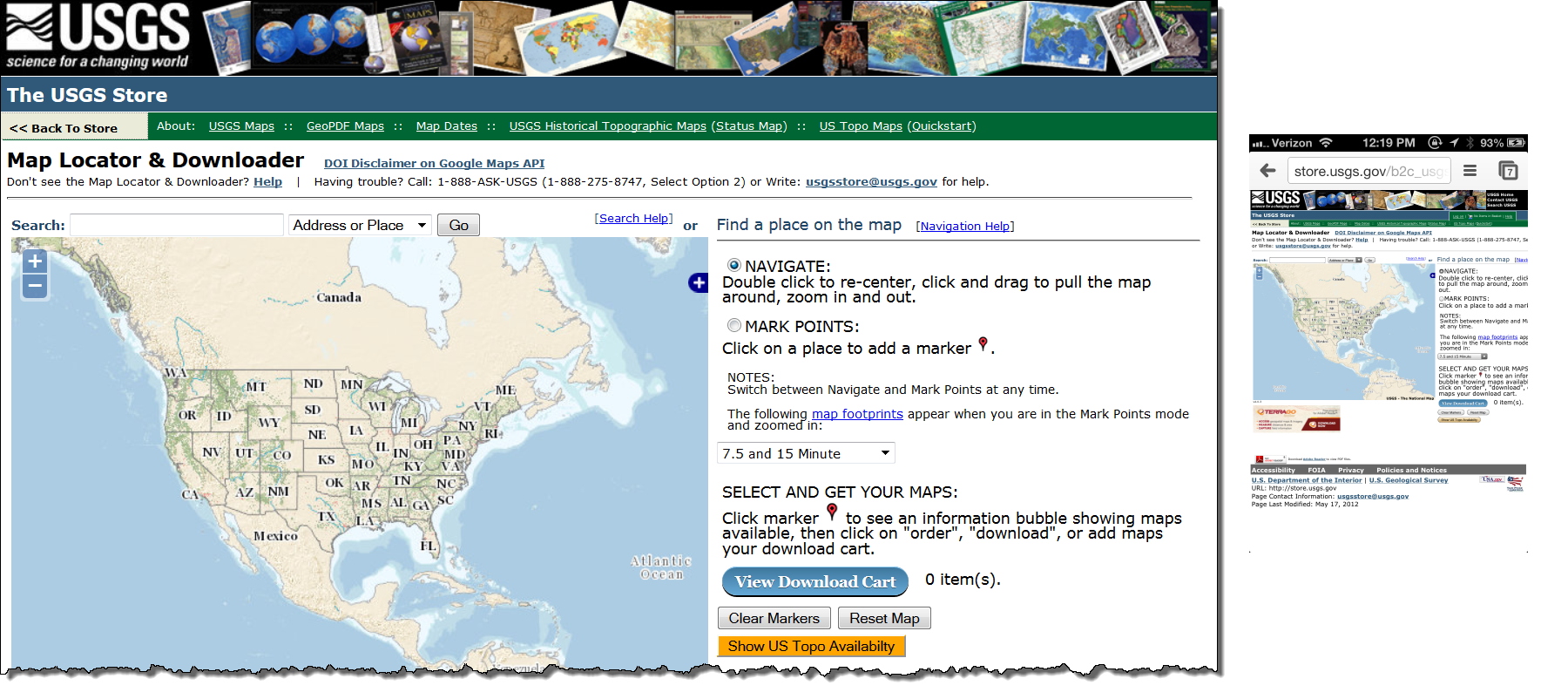
However, there are many applications on the website that will be difficult to implement on mobile devices, such as the map viewer below (browser version on the left, mobile version on the right):
Further Reading
In all, we congratulate USGS for actively soliciting feedback and user response to help them ensure a positive user experience. After all, the USGS web team has no way of knowing if the intended improvements will deliver an improved user experience unless they ask the users themselves!
Our team has led many projects intended to gather sound research and user feedback, data that helps our clients improve user satisfaction and usability. Visit our user experience case study library for a closer look.
