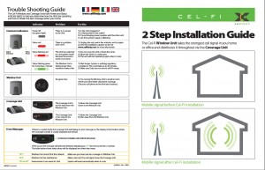
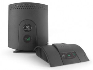
Nextivity’s smart repeaters optimize the indoor transmission and reception of wireless signals, eliminating in-home dead zones while protecting the integrity of the carrier’s network. TecEd was asked to create intuitive user interfaces for the Window Unit (WU) and Coverage Unit (CU) so consumers can install them without calling customer support.
Background
Our Client: Nextivity, Inc. is a leading developer of in-building cellular technology for optimizing the transmission and reception of wireless signals
Product: Smart repeaters optimize the indoor transmission and reception of wireless signals, eliminating in-home dead zones while protecting the integrity of the carrier’s network
Challenge: Create intuitive user interfaces for the Window Unit and Coverage Unit so consumers can install them without calling customer support
Objectives
- Wordless UIs for international use of product units
- Ability to alert if units are too close to or far from the Window Unit, in a viable location, or other factors that impacts performance
- Provide quick and easy product installation with minimal instructions for all target users
- Increase subscriber retention and satisfaction for wireless carriers
Methodology
- To understand what had already been considered and any design constraints we underwent a discovery and background research phase. We dove into the technology and viewed discarded UI design ideas.
- Creation of personas and installation scenarios for the primary audience—people who have weak or no cell phone reception at home—to define and document for whom we were designing.
- Iterative design and testing of two UIs with surrogate users. Wireframes were created for initial testing with surrogate users, visual designers created the finished look. Several early designs of the Coverage Unit included:
| House Design | Arrows to Convey Movement |
Arrows and Position to Convey Movement |
 |
- In-home usability testing of out-of-box experience and product installation with non-technical wireless consumers at two locations—single and multi-story houses to emulate real-world home environments.
Design Solutions
- Employ wireless tower and signal bars, familiar design concepts from cell phones, were used on the Window Unit—the more bars, the better carrier signal
- Light indicators specify successful positioning of Coverage Unit—the red Coverage Unit with a directional arrow: move it; the green Coverage Unit: good coverage
| Move the Coverage Unit | Good Coverage |
 |
 |
- Add a coverage digital indicator close to the Coverage Unit’s house indicator to determine coverage level
Results
- Simple, elegant interface
- Intuitive, “plug-and-play” product installation
- Addition of a 1-page Quickstart guide, with tips on placing units, boosted installation success
Nextivity’s Final Coverage Unit and Window Unit Design with the TecEd Designed User Interfaces


